Overview
Teaching: 65 min
Exercises: 10 minQuestions
Data Wrangling in R
How do I work with data to make cool, complex graphs easily in R
Objectives
Working in the TidyVerse
Plotting using ggplot
Using different colors, grouping data, subplots.
by Umi Hoshijima, Corinne Fuchs, and Geraziella DiRenzo, based on material by Naupaka Zimmerman, Andrew Tredennick, & Kartik Ram
Goals
The goal of this module is to give a brief introduction to the world of quick data analysis using dplyr, to serve as reference when working with your own datasets. You will be observing your manipulated data using the package ggplot.
By the end of this lesson, you should be able to:
- Plot using
ggplot - use
dplyrexamples to understand the principles behind this method of data analysis - Streamline and increase legibility of code by using
pipes
What is a package?
- An R package extends the functionality of R beyond its out-of-the-box capabilities. Packages exist for all sorts of things (stats,
- Last I checked, there are over 12,000 official packages for R. This is quite overwhelming, and generally you install what you need as you go. For inspiration, select packages are sorted into groups by function at the CRAN Task View.
- The two packages were are using here are part of the Tidyverse, a group of packages that are produced by the same team and work well together. These are generally great complementary packages for data science.
What is ggplot?
ggplot2is the package,ggplotis the main function, but as you see we will use quite a few functions fromggplot2in this lesson.- The ‘gg’ stands for grammar of graphics.
- A syntax for making plots and figures.
- Defines components of a figure.
- Coherent, consistent syntax for a range of plotting.
Getting Started with ggplot:
Let’s install and load our ggplot2 package. We’ll also be using some dplyr here as well.
install.packages("ggplot2")
install.packages("dplyr")
library(ggplot2)
library(dplyr)
Then, import the mammals dataset. This is a subset of a “species-level database of extant and recently extinct mammals. You can download it HERE.
#loading mammals dataset for ggplot exercise:
setwd("~/Dropbox/SoftwareCarpenty18/")
mammals <- read.csv("data/mammals.csv", head=T)
# OR:
mammals <- read.csv(file.choose()) # to bring up a file dialog
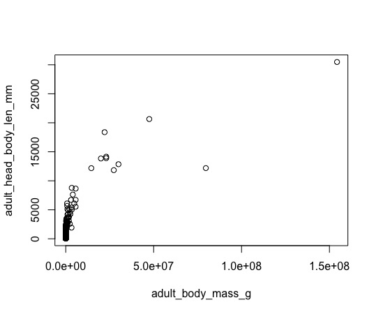
Let’s compare two plots of the same data.
Here are the codes to make plots of body size vs. litter size:
plot(adult_head_body_len_mm ~ adult_body_mass_g, data=mammals)
OR
ggplot(data=mammals, aes(x=adult_body_mass_g, y=adult_head_body_len_mm)) + geom_point()
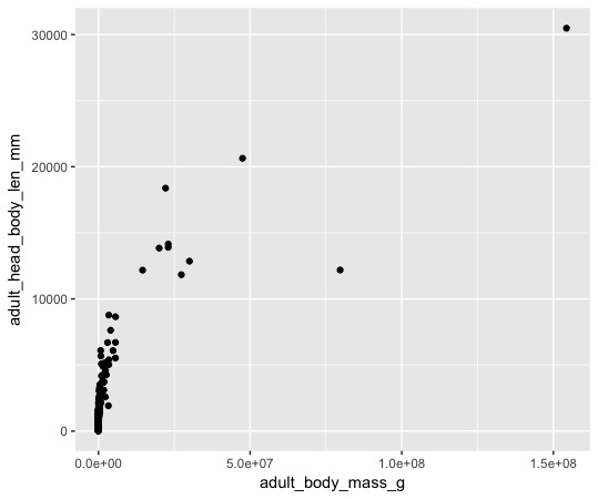
Although the plots look similar, we can see differences in the basic structure of the code, and some of the default formatting. The first is obvious, in which plot(y~x) means “plot y with respect to x”, which is fairly standard in many functions in R (e.g. statistics). That second line of code probably looks a little like gobbledygook. But it won’t help you get gold out of Gringott’s until you understand all its parts.
So why do we need another plotting method, to make the same plot?
Both plot and ggplot can be used to make publication quality figures, and both certainly have limitations for some types of graphics. Arguably, ggplot excels over base graphics for data exploration and consistent syntax, and we’ll explore those in the end of the lesson.
| ggplot2 Pros: | ggplot2 Cons: |
|---|---|
| consistent, concise syntax | different syntax from the rest of R |
| intuitive (to many) | does not handle a few types of output well |
| visually appealing by default | |
| entirely customizable | |
| Easy to standardize formatting between graphs |
| base graphics Pros: | base graphics Cons: |
|---|---|
| simple, straightforward for simple plots | syntax can get cumbersome for complex figures |
| entirely customizable | fiddly for adjusting positions, sizes, etc. |
| - | not visually appealing by default |
Parts of a ggplot plot:
There are several essential parts of any plot, and in ggplot2, they are:
- the function:
ggplot() - the arguments:
- data - the dataframe
- aes - the “aesthetics”, or what columns to use
- geom - the type of graph
- stats
- facets
- scales
- theme
- …and others
In ggplot you absolutely need the first three arguments: data, aes, geom to make any graphic. The latter arguments help you customize your graphic to summarize data, express trends, or customize appearances. We won’t cover any these in much depth, but if you are comfortable with what we show you today, exploring the vast functionality of geom, stats, scales, and theme should be a pleasure.
ggplot()
Some people like to assign (<-) their plot function to a variable, like this:
myplot<-ggplot(...)
data
- This is the data you want to plot
- Must be a data.frame
For this lesson, we are going to look at the mammals data set that we used earlier.
head(mammals)
Let’s build a scatter plot of mammal body size and litter size.
myplot<-ggplot(data=mammals... )
aes
For aesthetics.
How your data are to be visually represented. aes() is an argument within ggplot that takes its own arguments, aes(x=, y=). These are your independent (x) variable and your dependent (y) variable. ggplot2 nerds call this mapping. As I understand it, they mean that you are mapping data points by the data values, in a ‘landscape’ of a coordinate system based on your data. Mapping will be important later, when we add meaningful colors and symbols to differentiate things like mice and whales, based on a variable that corresponds to one of our mapped data points.
What happens if we make a plot just using data and aes?
myplot<-ggplot(data=mammals, aes(x=adult_body_mass_g, y=adult_head_body_len_mm))
myplot
If you executed this code, you probably got an blank, data-less plot. Why?
So far, we have told ggplot where to look for data (data), and how to represent that data (aes), but not what to do with the data values. So there is nice space for our data… but we still need to actually plot the data.
geom
For geometry.
This is how we create the ‘layer’ we actually see as our figure.
These are the geometric objects likes points, lines, polygons, etc. that are in the plot
geom_point()geom_line()geom_boxplot()geom_text()geom_bar()geom_hline()- 25 more!
Let’s add a geom to make that scatter plot from above.
In this scatterplot, we tell ggplot to use the mammals dataset, to plot body mass on the x and body length on the y axis, and to plot those data as points, creating a scatterplot…
ggplot(data=mammals, aes(x=adult_body_mass_g, y=adult_head_body_len_mm))+
         geom_point()
To make this code formatted neatly, with geom_point on the second line, simply press enter after the + sign. Rstudio will automatically tab into the second line. (Hint: to correctly tab any line automatically, put your cursor on the code line and type cmd + i (mac) or ctrl + i (windows)).
When you run this code, Rstudio will automatically recognize the + and know that the lines should run together. You should produce a plot with points displaying our data.
Plotting by order: challenges of more complex visualization
Changing the aesthetics of a geom
This scatterplot is pretty simple. But what if we wanted to see which orders had which body sizes?
Changing the aesthetics of a geom
You can easily specify which data points get a certain: color, size, shape. You can set or map an visual property to your data points. But, if you set it, it is not part of the aesthetic, because the data values have no influence on a set property. If you map that property within the aesthetic, what you see will depend on your data values.
Lets set the size of the data points to make them easier to see when projected to an audience:
ggplot(data=mammals, aes(x=adult_body_mass_g, y=adult_head_body_len_mm))+
  geom_point(size=3)
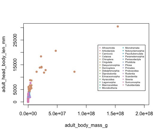
…or map some useful color onto our values. Mapping is based on your data values, usually of a yet-unplotted variable that also describes each point or observation. In this case, taxonomic Order is a property that describes each individual mammal in our dataset, so we can map the Order on to each data point to differentiate them:
ggplot(data=mammals, aes(x=adult_body_mass_g, y=adult_head_body_len_mm))+
  geom_point(size=3, aes(color=order))
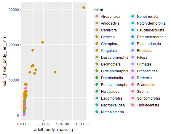
Thats a lot of orders to look at, and its hard to tell who’s who. Note however, the automatically generated legend. Yew! That doesn’t happen in plot very easily, but you get it automatically in when ggplot maps colors or shapes to categorical variables.
To do this kind of plot without using ggplot, you would need something to this effect:
# Library to make color palettes - ggplot does this automatically
install.packages('colorspace')
library(colorspace)
# make empty plot with space for the legend
plot(adult_head_body_len_mm ~ adult_body_mass_g, data=mammals, type = 'n',
     xlim = c(0,200000000))
# get lists for order
orders = unique(mammals$order)
# make colors
colors = rainbow_hcl(length(orders))
# plot every order in a different color
for (a in 1:length(orders)) {
  dat_plot = mammals[mammals$order == orders[a],]
  points(adult_head_body_len_mm ~ adult_body_mass_g, data=dat_plot,
         col = colors[a], pch = 16)
}
# get legend in the right place, and manually set values.
legend(120000000,23000, legend = orders, col = colors, cex = 0.5, pch = 16, ncol = 2)
…ew.
I think you ge the idea. Let’s limit the number of Orders we are examining in our figure.
Dplyr
We can use dplyr here, which we have already loaded. You’ll notice that as we work on larger datasets, viewing and visualizing the entire dataset can become more and more difficult. Similarly, analyzing the datasets becomes more complex. Dplyr can be helpful for dealing with medium-size datasets such as this - both for stats and for visualization. dplyr will allow us to perform more complex operations on single dataframes in intuitive ways.
First off, though, let’s explore some very handy sorting and viewing functions in dplyr. glimpse() is a quick and pretty alternative to head():
Dplyr has quick/intuitive functions for manipulationg datasets.
head(mammmals)
glimpse(mammals)
All of the previous plots we created had a ton of orders - let’s try looking at some individually. If you want to filter a dataset using a certain column (e.g. order), you can use the filter command in dplyr:
# This returns the data from mammals were order equals rodentia.
tails = filter(mammals, order=="Rodentia")
head(tails)
Now suppose I’m interested in finding the large mammals:
large_mammals = filter(mammals, adult_body_mass_g > 1000000)
head(large_mammals)
We can also combine these sorts of statements using ‘and’ or ‘or’:
filter(mammals, order == "Rodentia" & adult_body_mass_g > 1000000)
filter(mammals, order == "Rodentia" | adult_body_mass_g > 1000000)
There’s also cool functions in dplyr to select columns by name (select), or to arrange the dataframe by a certain column (arrange).
Let’s find the heaviest terrestrial mammal. Let’s do this first by finding all terrestrial mammals. Then get rid of all the columns we don’t need, then arrange what’s left by size to figure out which one is the heaviest.
# First, make a terrestrial mammals dataframe:
tmammals = filter(mammals, habitat == 'T')
# Let's simplify the column names
colnames(tmammals)
tmammals_simple = select(mammals, species, adult_body_mass_g)
#Let's arrange this data frame by body mass:
arrange(tmammals_simple, adult_body_mass_g)
head(arrange(tmammals_simple, adult_body_mass_g))
head(arrange(tmammals_simple, desc(adult_body_mass_g)))
Challenge: Make a scatterplot of weight vs. litter size, but only with Rodentia and Cetecea orders. color by order.
boxplot of marine vs terrestrial body size?
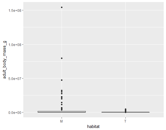
Let’s analyze the masses of mammals to see if they’re different based on their habitat (marine or terrestrial). We can do this with a boxplot, adult body mass separated by habitat.
We’re first going to make a simple plot before making it fancy:
# Create a simple plot
ggplot(data = mammals, aes(x = habitat, y = adult_body_mass_g))+geom_boxplot()
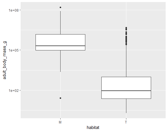
This looks good, but clearly there are a few large numbers making this hard to visualize. Let’s fix this by “log-transforming” the y axis:
# Make the y axis on the log scale
ggplot(data = mammals, aes(x = habitat, y = adult_body_mass_g))+geom_boxplot()+
  scale_y_log10()
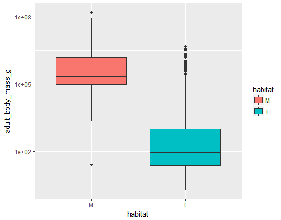
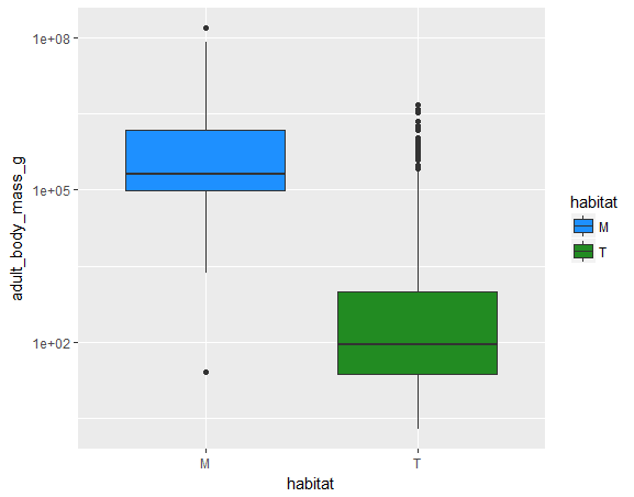
This looks good, but is a bit bland. We can change the colors of these box plots by which habitat they are from:
# Change boxplot color by habitat
ggplot(data = mammals, aes(x = habitat, y = adult_body_mass_g, fill = habitat))+geom_boxplot()+
  scale_y_log10()
These default colors are good for order, but are a bit unintuitive for marine vs. terrestrial. Let’s use blue for marine, and green for terrestrial. You can set colors in R using a variety of methods, including hex codes and rgb(). You can also choose from some premade ones, and all of these can be found on this color cheatsheet.
# Default colors are fairly unintuitive for marine vs terrestrial, so let's set manually:
ggplot(data = mammals, aes(x = habitat, y = adult_body_mass_g, fill = habitat))+geom_boxplot()+
  scale_y_log10()+
  scale_fill_manual(values = c("dodgerblue", "forestgreen"))
Now just some last tidy-up for good practice:
# Change the legend title
ggplot(data = mammals, aes(x = habitat, y = adult_body_mass_g, fill = habitat))+geom_boxplot()+
  scale_y_log10()+
  scale_fill_manual(name = "Habitat", values = c("dodgerblue", "forestgreen"))

# Change the x and y labels
ggplot(data = mammals, aes(x = habitat, y = adult_body_mass_g, fill = habitat))+geom_boxplot()+
  scale_y_log10()+
  scale_fill_manual(name = "Habitat", values = c("dodgerblue", "forestgreen"))+
  labs(x = 'Habitat', y = 'Adult body mass (g)')

# Change the title:
ggplot(data = mammals, aes(x = habitat, y = adult_body_mass_g, fill = habitat))+geom_boxplot()+
  scale_y_log10()+
  scale_fill_manual(name = "Habitat", values = c("dodgerblue", "forestgreen"))+
  labs(x = 'Habitat', y = 'Adult body mass (g)', title = 'Body mass, by habitat')
Great!
Let’s add multiple geoms:
Suppose we are interested in seeing all of the individual datapoints in addition to the boxplot. That is as easy as using another geom in addition to geom_boxplot. If you just put geom_point at the end, it will plot points with the dataframe, x and y that you have already specified in the first ggplot call.
ggplot(data = mammals, aes(x = habitat, y = adult_body_mass_g, fill = habitat))+geom_boxplot()+
  scale_y_log10()+
  scale_fill_manual(name = "Habitat", values = c("dodgerblue", "forestgreen"))+
  labs(x = 'Habitat', y = 'Adult body mass (g)')+
  geom_point()
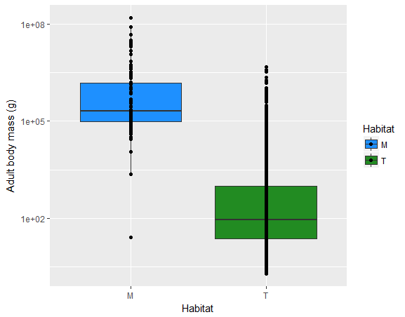
Wait! They are all on top of each other! Let’s fix that by using geom_jitter(), which as the name implies jitters the points.
ggplot(data = mammals, aes(x = habitat, y = adult_body_mass_g, fill = habitat))+geom_boxplot()+
  scale_y_log10()+
  scale_fill_manual(name = "Habitat", values = c("dodgerblue", "forestgreen"))+
  labs(x = 'Habitat', y = 'Adult body mass (g)')+
  geom_jitter()
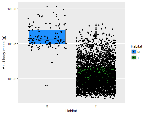
AHHHH!!! So many points ontop of the terrestrial boxplot! Let’s change the transparency of the points again using the argument “alpha”- and this allows us to see where points overlap.
ggplot(data = mammals, aes(x = habitat, y = adult_body_mass_g, fill = habitat))+geom_boxplot()+
  scale_y_log10()+
  scale_fill_manual(name = "Habitat", values = c("dodgerblue", "forestgreen"))+
  labs(x = 'Habitat', y = 'Adult body mass (g)')+
  geom_jitter(alpha = 0.1)
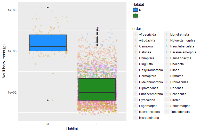
One last neat thing you can do is add the orders as different colors to this boxplot as well.
ggplot(data = mammals, aes(x = habitat, y = adult_body_mass_g, fill = habitat))+geom_boxplot()+
  scale_y_log10()+
  scale_fill_manual(name = "Habitat", values = c("dodgerblue", "forestgreen"))+
  labs(x = 'Habitat', y = 'Adult body mass (g)')+
  geom_jitter(aes(x = habitat, y = adult_body_mass_g, col = order), alpha = 0.2)
![]()
This is a lot to take in, but you get the general idea. Note that the order that you puts these geoms does matter. We have the points above the boxplot because we have geom_jitter after geom_boxplot. switching the two puts the boxplot above the points.
ggplot(data = mammals, aes(x = habitat, y = adult_body_mass_g, fill = habitat))+
  scale_y_log10()+
  scale_fill_manual(name = "Habitat", values = c("dodgerblue", "forestgreen"))+
  labs(x = 'Habitat', y = 'Adult body mass (g)')+
  geom_jitter(aes(x = habitat, y = adult_body_mass_g, col = order), alpha = 0.2) + geom_boxplot()
back to dplyr: grouping
As you saw with the previous graph, this is a lot of data and challenging to visualize trends sometimes. we have a lot of species for each order, so let’s go ahead and work towards some goals for data summarizing:
- what’s the average mass of each order?
To do this, we need to first learn how to get average mass using the dplyr function summarize:
summary(mammals)
summarize(mammals, mean_mass = mean(adult_body_mass_g))
?mean
summarize(mammals, mean_mass = mean(adult_body_mass_g, na.rm = TRUE))

# note this is the same as:
mean(mammals$ adult_body_mass_g, na.rm = TRUE)
This in itself doesn’t seem super productive. We just found a longer, more complicated way to do something we already knew how to do! However, dplyr does have a trick up its sleeve: now that we have that, it’s super easy to figure out the mean mass of each order:
mammals_group_order = group_by(mammals, order)
# This creates a new version of mammals that is tagged with the "group" order - that is, any summarize operation honors this grouping.
mammals_group_order
mammals_summarize = summarize(mammals_group_order, mean_mass = mean(adult_body_mass_g, na.rm = TRUE))
mammals_summarize = summarize(mammals_group_order, mean_mass = mean(adult_body_mass_g, na.rm = TRUE),
mean_len = mean(adult_head_body_len_mm, na.rm = TRUE))
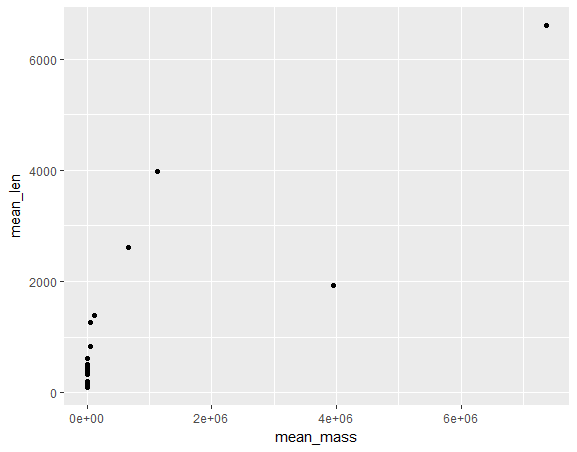
ggplot(mammals_summarize, aes(x = mean_mass, y = mean_len))+geom_point()
This is great! seems like this could save a TON of time for us. However, it is strange that we need to make this mammals_group_order as a stepping stone. We’re really using it as an intermediate to get from group_by to summarize.
Turns out there’s a way around this that never makes that middle variable, and it’s called pipes! Pipes are part of dplyr and allow you to chain different commands together. For example:
a = c(1,2,3)
#This
mean(a)
# is the same as this:
a %>% mean()
Let’s say you want to know the range of a:
a = c(1,2,3)
b = range(a) # this gives you the biggest and smallest
c = diff(b)
c = diff(range(a))

# with pipes:
a %>%
  range() %>%
  diff()
Let’s apply this to our previous group_by, summarize, and ggplot:
mammals %>%
  group_by(order) %>%
  summarize(mean_mass = mean(adult_body_mass_g, na.rm = TRUE),
          mean_len = mean(adult_head_body_len_mm, na.rm = TRUE))%>%
  ggplot( aes(x = mean_mass, y = mean_len))+geom_point()
Challenge: Use pipes to redo the first challenge that you did here. Reminder it’s to make a scatterplot of weight vs. litter size, but only with Rodentia and Cetecea orders. color by order. Oh, and log-transform both axes while you’re at it!
facet marine/terrestrial things
We can use dplyr to observe our varibales in various groups. It turns out you can use ggplot to further break up your data for visualization. For example, you can look at the previous body length and body mass variables, but make two plots: one for each habitat (marine or terrestrial) automatically:
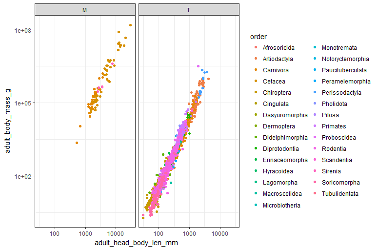
  ggplot(mammals, aes(x = adult_head_body_len_mm, y = adult_body_mass_g))+geom_point(aes(color = order))+
  scale_x_log10()+ scale_y_log10() + facet_grid(.~habitat)

  ggplot(mammals, aes(x = adult_head_body_len_mm, y = adult_body_mass_g))+geom_point(aes(color = order))+
  scale_x_log10()+ scale_y_log10() + facet_grid(habitat~.)
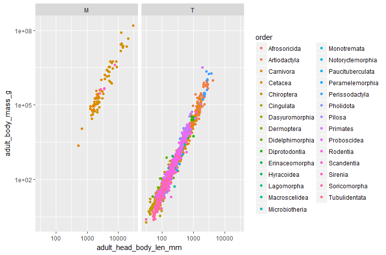
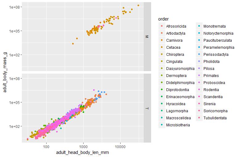
Wow, that was easy! Remember that in this case, it’s rows vs columns. So whatever comes before the tilde is rows, whatever comes after the tilde is columns. if you don’t want to facet in either direction, put a period there.
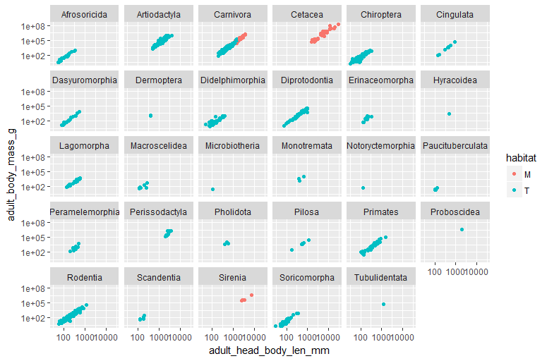
We can also do something silly, like plot it differently for each order. But it would be ridiculous to put them all in one row or one colum - facet_wrap will automatically fill up your space with a grid of ordered plots.
  ggplot(mammals, aes(x = adult_head_body_len_mm, y = adult_body_mass_g))+geom_point(aes(color = habitat))+
  scale_x_log10()+ scale_y_log10() + facet_wrap(~order)
Final section: making ggplot pretty
Suppose we aren’t too jazzed on the grey backgrounds and default look. ggplot makes it super easy to change those:
  ggplot(mammals, aes(x = adult_head_body_len_mm, y = adult_body_mass_g))+geom_point(aes(color = order))+
  scale_x_log10()+ scale_y_log10() + facet_grid(.~habitat) +
  theme_bw()

  ggplot(mammals, aes(x = adult_head_body_len_mm, y = adult_body_mass_g))+geom_point(aes(color = order))+
  scale_x_log10()+ scale_y_log10() + facet_grid(.~habitat) +
  theme_minimal()
There are quite a few defaults, which you can find listed and exampled here. However, you may want to start with one of these and then tweak things individually: like text size, font, background colors individually… the list goes on an on! Here is a list of all the things you can tweak. For example,
Let’s make the background white, remove the major and minor lines, and adjust the text size of the axis text and axis titles, and change the background color to the facet names to “white”.
ggplot(mammals, aes(x = adult_head_body_len_mm, y = adult_body_mass_g))+geom_point(aes(color = order))+
  scale_x_log10()+ scale_y_log10() + facet_grid(habitat~.)+
  theme_bw()+
  labs(y = "Adult body mass (g)", x = "Adult head body length (mm)")+
  theme(axis.text.x = element_text(size = 12, color = "black"),
        axis.text.y = element_text(size = 12, color = "black"),
        axis.title.y = element_text(size = 12, color = "black"),
        axis.title.x =element_text(size = 12, color = "black"),
        legend.title =element_text(size = 12, color = "black"),
        legend.text =element_text(size = 12, color = "black"),
        strip.background = element_rect("white"),
        panel.grid.major = element_blank(),
        panel.grid.minor = element_blank())
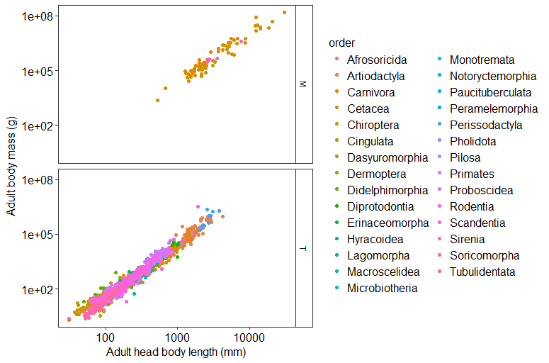
This is just one example of how you can tweak all of the various parameters of a theme. You can get really in the weeds with this, but often people will tweak one to their liking and apply it to all of their plots.
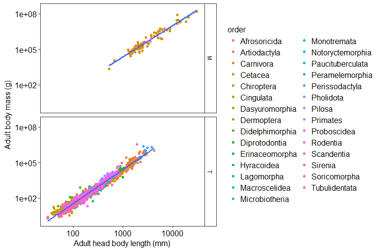
Let’s add a linear fit to the plots!. We use the function stat_smooth(method = “lm”). Notice you can also specify your own functions using the argument “y =….”
ggplot(mammals, aes(x = adult_head_body_len_mm, y = adult_body_mass_g))+geom_point(aes(color = order))+
  scale_x_log10()+ scale_y_log10() +
  facet_grid(habitat~.)+
  theme_bw()+
  labs(y = "Adult body mass (g)", x = "Adult head body length (mm)")+
  theme(axis.text.x = element_text(size = 12, color = "black"),
        axis.text.y = element_text(size = 12, color = "black"),
        axis.title.y = element_text(size = 12, color = "black"),
        axis.title.x =element_text(size = 12, color = "black"),
        legend.title =element_text(size = 12, color = "black"),
        legend.text =element_text(size = 12, color = "black"),
        strip.background = element_rect("white"),
        panel.grid.major = element_blank(),
        panel.grid.minor = element_blank())+
  stat_smooth(method = "lm")
Let’s save the plot and learn to save it in different sizes. If you just put a file name in, it will save to the current directory (getwd() and setwd() to view and change). Othwerisse you can put a relative or absolute path in to change that.
ggsave("Mass_v_length1.pdf", height = 8, width = 6)

ggsave("Mass_v_length2.pdf", height = 6, width = 8)
Bonus Round: more ggplot2 and resources
We’ve merely touched on the great things dplyr and ggplot can do. dplyr is also part of a larger “universe” of packages, the tidyverse, which try to make it easier to wrangle data in R; there are other packages to change data formats (tidyr), make dates easier to deal with(lubridate), and more.
ggplot can do so much more, as well. We’ve used default themes and added a little of our own flair, but you can also save theme details into your own custom themes. You can also add error bars, special symbols in axis labels, angled axis labels, and so much more. There are even packages that complement ggplot to help you create color pallettes or provide colorblind-friendly ones.
If you’re interested in learning more about ggplot, we’ll also be teaching our first follow-up session on some of those things, plus other ggplot magic! But, you’re also well-equipped to do some of your own exploring after today. There are tons of excellent resources online to help. We’ve already mentioned the official ggplot documentation. RCookbook has an excellent section on graphics and is particularly helpful for learning how to tweak common components of a plot, like labels and legends and facets.
The Rstudio website also has some very helpful cheatsheets for ggplot, dplyr, and many other packages (including other tidyverse). These are great to jog your memory or to look up a command you don’t remember the name of.
Key Points
Dplyr is a great tool for exploring data
Pipes can make your code more legible and more logical
What is ggplot? And why have multiple graphics tools?
{“Parts of a ggplot figure”=>”ggplot, data, aes, geom,”}
Using mapping to make your figures more informative.
How facets are helpful and how to make them.
Using themes to make your figures more pleasing.
Saving figures.